Others
22 December 2021
How Design Affects Human Behaviour

Designing for an environment comes after knowing what actually happens in that environment. The more the designer is in touch with the intended purpose of the setting, the more the designer will be able to optimize the goal of the design and create value for the firm. Knowing the values and sentiments that will occupy the space will take a designer beyond a cliched and standard mindset. For example, designing an office for a law firm (with all its seriousness) will be very different from designing an office for a marketing firm (which houses creative and fun people). So, it all comes back judging what kind of people will inhabit your structure or what kind of people will look at your design.
If you take a look around you, you’ll notice how everything has a design element incorporated in it; some are good, and some are bad. For example, are the parking divisions too close to each other and are solely made for sedans and hatchbacks? Is the road sign too small for you to figure out what it says? Is the ‘Buy’ button too small and unnoticeable to the customer that he/she leaves your site in frustration?
What affects behaviours?
According to a study, our behaviour is influenced by factors such as age, gender, health, mental state, personality, emotions, beliefs, and life experiences amongst many other things. It is also affected by the environment we are present in, the people around us, what’s happening, etc.
Some factors can be designed, like exterior/interior design, and others cannot be changed, but can be designed for. Like if you know your target audience are teenagers with mental health issues, you could create something that would match their personality, according to their age, mental problems, likes/dislikes, emotions, etc.
Why design for behaviour?
It is almost certain that design affects your brain. For instance, colors evoke different actions in your brain; green encourages people to interact and gives off a ‘safe’ vibe, and red forces people to halt and think twice about their actions. By gaining a feel for people’s behaviour and attitudes, a designer can predict what actions would be taken.
Let’s study human behaviour and see what works and what doesn't.
1) Humans are impatient
A research by NNGroup showed that people read webpages with 79% of them only scanning through it all. And newer research showed that email newsletters are more hurriedly scanned through than web pages. So if you’re a designer and are making a webpage keeping these facts in mind, you’d:
- place the important stuff brilliantly so the users don’t miss it,
- design an impeccable website/app to capture the user’s attention in the first few seconds and keep them hooked,
- group content that is logically related together,
- employ a lot of headings onto your page,
- keep paragraphs small to keep it easy on the users’ eyes, and
- use bullets instead of commas wherever you can.
2) Humans reject change
People find it quite difficult to adapt to or accept something new. When material design became popular, it was fairly new, but now everybody knows that a hamburger icon takes you to the menu, the wheels icon takes you to the settings, and a red icon will end your call no matter what device you’re on.
There exist a set of laws that users all across the globe resonate with. So when you design a user interface, don’t stray far from the status quo to keep your design relevant and successful.
This is what you should do:
Use design systems
let your design stay consistent throughout an app to make it easy for users to learn, adapt, and then work your app like you want them to.
Don’t reinvent the wheel
don’t unnecessarily introduce something new to the layout. For example, a navigation tab is at the bottom of an app for users to easily use their thumb which 90% of humans interact with.

3) Humans are know-it-alls
People don’t like to read instructions—they find them boring, especially if they go on for long. For example, you might’ve noticed that you barely read the ‘Terms & Conditions’ and can’t wait to skip to the end and checkmark it. So you need to make sure that your design is anything but complex and is as obvious as possible to avoid getting it chucked like a user manual of a refrigerator.
In the case where instructions are imperative for the user, and you absolutely have to have them read it, images and illustrations have proven to be effective for grabbing a user’s attention—and we all know that pictures speak a lot more than words do.

4) Humans are emotional beasts
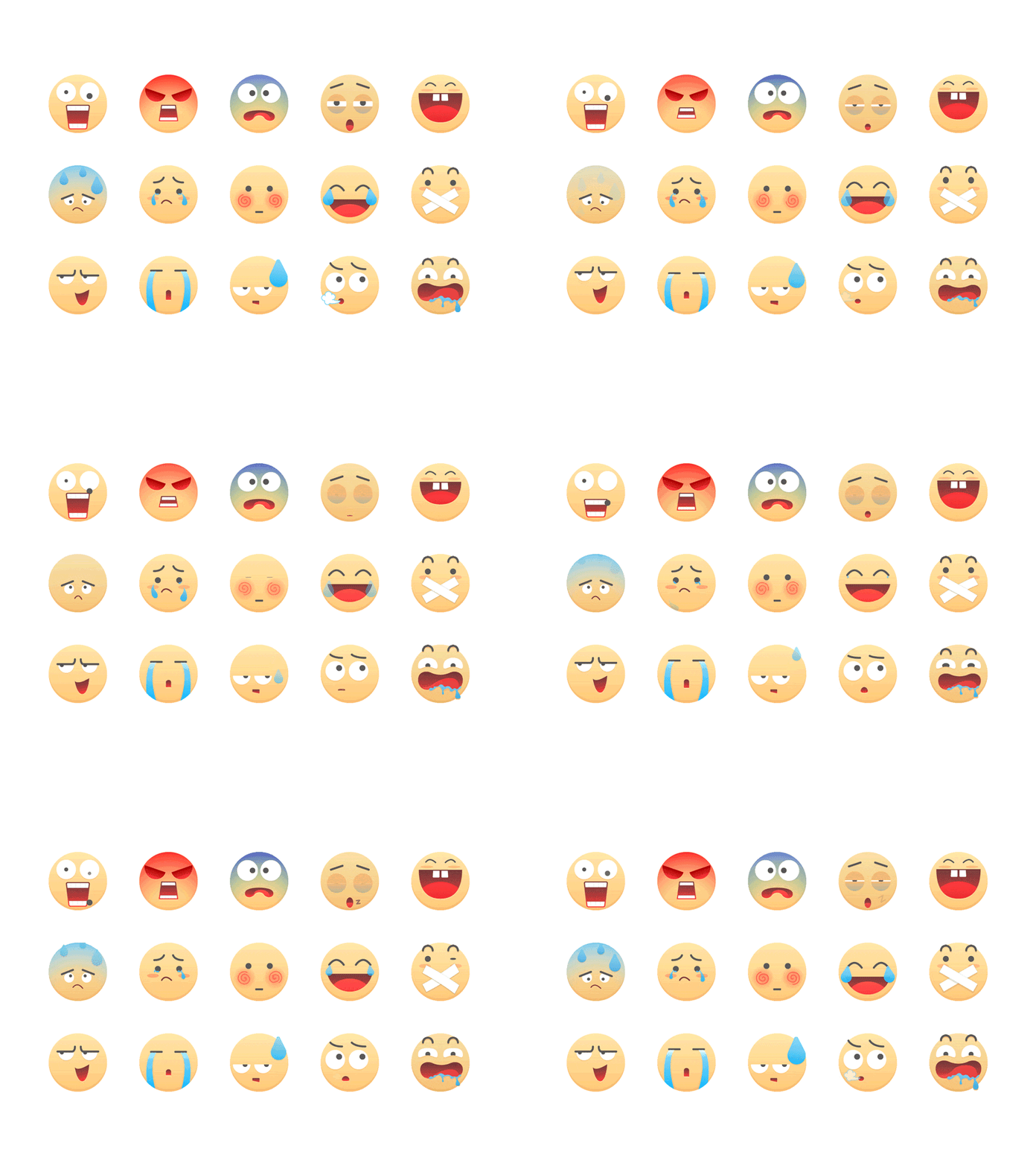
Out of all the emotions a human can display, it could be shrinked into 6 major categories; happiness, sadness, anger, surprise, fear, and disgust. Which is why it is imperative to give a long thought to the colors, shapes, layout, etc you use on your UI. Users want to be treated as ‘humans’ rather than ‘website visitors’, so your interface should appeal to people’s emotions rather than simply putting stuff out there.
This is what you should do:
Personalize the experience
For the user so when they believe it is made just for them, they’ll be ‘into’ the products.
Empathize
with the user by using colors that depict emotions you’re trying to evoke. Like yellow for excitement, lilac for peace and elegance, and red for dangerous or passionate.
Increase engagement
To reduce bounce rate and keep the user hooked to your website/app.

Conclusion
So building an interface starts from understanding your audience, their problems, analyzing info, designing solutions, testing, and implementing amongst many other crucial steps. Adding behavioural study into your design is like adding a new lens to your user experience.

