Others
08 December 2021
Use of Gradients in UI Design
What are Color Gradients?
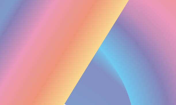
No, it’s not the early 90s Microsoft PowerPoint word art. Gradients are the transition of one color to another and are used to add another dimension to a design as though they are interacting with light and darkness. Using a gradient with various levels of opacity can also create a sense of different distances between objects.
Gradients are the New Trend
Majorly popular back in the 90s, gradients hit a stump until 2015, after which, it again gained popularity in an otherwise flat design-focused world. High-tech companies and social media startups all over the world have started using gradients to make their designs interesting. Nowadays, gradients are a must-have in every UI designer’s toolkit.
Just a few years ago, Instagram’s logo was redesigned with color gradients added to it.
Keep These In Mind While Making Gradients
When you’re employing gradients in your design, these are some of the things you should keep in mind before you start:
Choose the Right Colors
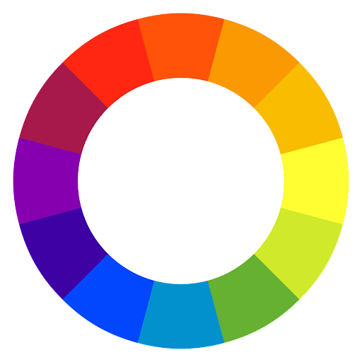
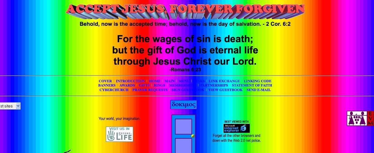
Colors can either make your design or break it. Having a sense of color theory is crucial to a UI designer; colors that are opposite on the color wheel have high contrast and can create an ambiguous design. Since colors set a precedent for an entire website or application, choosing colors from the same family is always an easy solution because they give a unified look to a design, bringing with it harmony and continuity. Otherwise, it’s going to look like something you see on a greenie’s artboard, titled ‘One of My Best Works’. Talk about barf!
Stay True to Your Content
You just cannot choose to use gradients everywhere. Know your client and users, and stay true to the content. If your subject is a hospital or a government organization, the use of gradients would be considered too over the top. If a brand has a serious identity, it is best to leave out gradients from your mind when you sit down to work. Always make sure that your gradient embodies the brand image and flows consistently throughout the design.
Smooth it Out
Take your time to smooth out your transitions. Nobody can perfect it in the first few tries, so don’t pull out your hair just yet. Start with three-stepped gradients, and try adding or deleting different steps, decrease the number of colors, and increase them if need be. Keep consistent, and the end result will always pay off!
Be Emotional
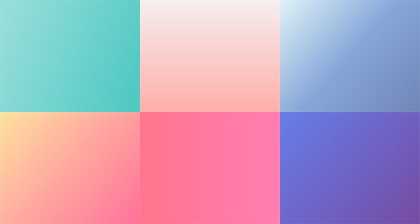
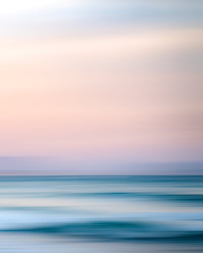
It is human nature to associate colors with feelings, and that is exactly what a UI designer should utilize. Choosing the right color gradients can connect you with your audience on a deeper level. Think of what you want your audience to feel when they look at your design. For example, the red-to-orange gradient sparks energy and joy, and the dark blue-to-blue gradient brings out a relaxing state of mind.
Contrast It
Gradients can harm text readability, and throw your compliance with Web Content Accessibility Guidelines off balance. The best way to combat this problem is to use contrasting elements; you should not go below the ratio of 4.5:1 for standard text.
Where’s the Light?
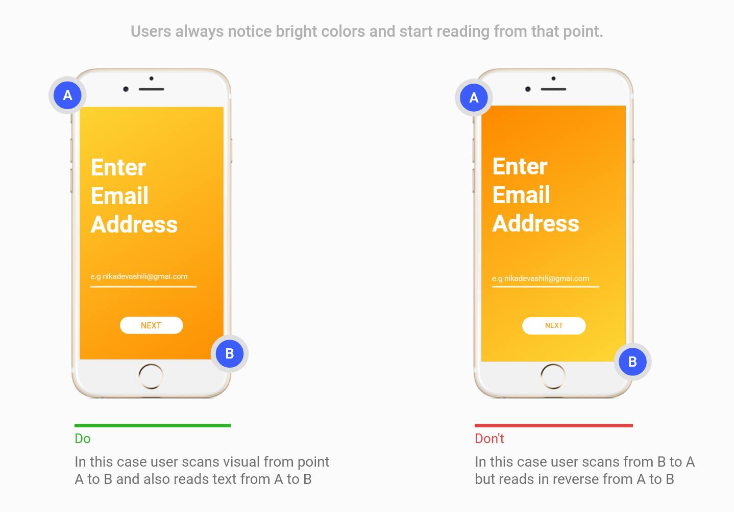
A clear idea of the source of light can make things easy for a UI designer. It allows you to use that information to cut a path and guide the user’s attention to any part of your page, product, or app. Users usually start reading/looking where a shade is the lightest, so be mindful of using light tones where you want the user to start looking at the screen.
Take Care of the Limits
Mixing different colors together form new colors, and designers sometimes go overboard with their canvases, giving birth to something that is messy and just rated poor. The use of gradients in UI, typography, illustration, and branding creates memorable and eye-catching colors only if you reel yourself in from time to time. The best practice of creating a good gradient is to use two colors or a maximum of three.
Conclusion
So, don’t be scared to use gradients! As a UI designer, a gradient can be another trick up your sleeve when you make attractive designs. As the world moves away from ‘flat’ UI designs, you can hook color gradients on your belt to add that ‘special something’ to your design.