Others
15 December 2021
UI Trends: Blur Effects and Shadows
When you look at the most successful UI designs across the world, you discover that they have one thing in common: they provide excellent functionality. And while functionality of a design is very essential for its success, aesthetics and visual details are equally important.
An integral part of a good UI design is drop shadows and blur effects, serving a number of purposes like attractiveness to functionality and responsiveness to make your design look modern, unique, and interactive. Elements that appear raised look like they could be pressed down, indicating to a user that this can be clicked with a mouse or tapped with a finger. And elements that appear sunken indicate to a user that it has room to be filled, a technique called visual signifier for input fields.
In Figma, there are four types of effects that can be used simultaneously on a design, object, layer or vector. They are:
1. Inner Shadow
2. Drop Shadow
3. Layer Blur
4. Background Blur
Let’s take a look at them one after the other, and determine their purpose.
Shadows
Shadows are used to give visual cues in the interface to tell the user what UI elements they’re looking at. Shadows also fall in line with a popular law of physics that says, “Everything in this physical world is dimensional and elements interact in three-dimensional space with each other,” giving importance to the fact that visualizing the position of an element in an interface is what gives a design its edge. There are two types of shadows that serve different purposes.
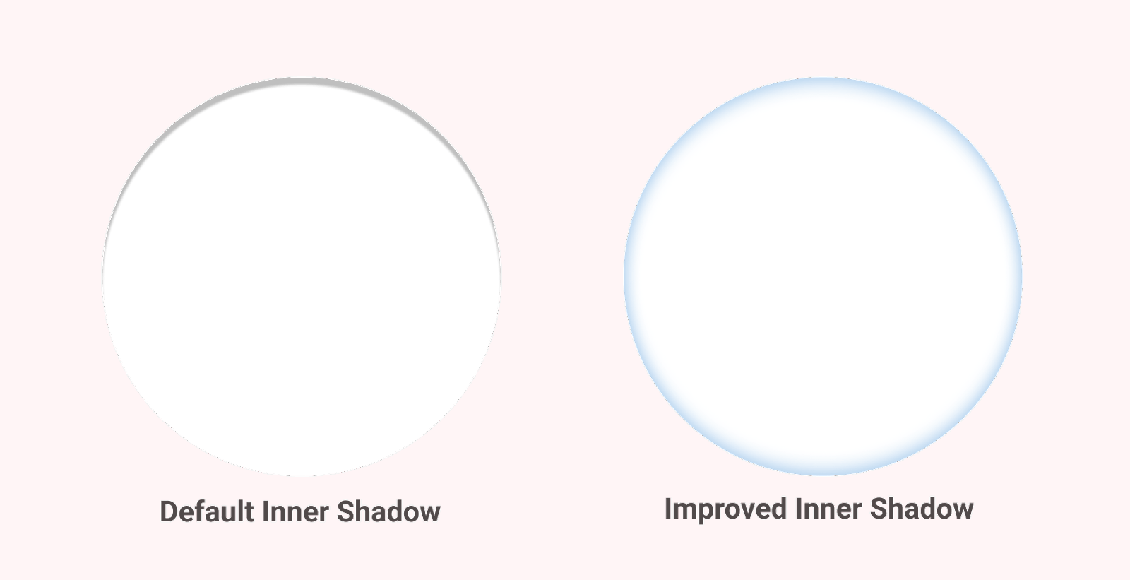
Inner Shadow
This effect is mostly used in neuromorphic designs, and uses the same parameters as a drop shadow. But unlike a drop shadow, inner shadows are applied within or inside an object to give it a clicked state of a button/card.
Drop Shadow
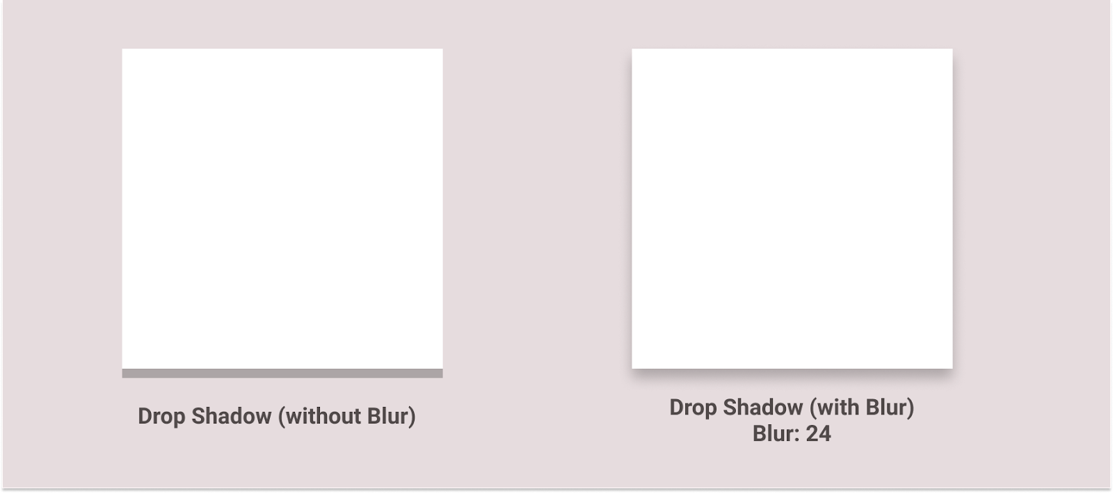
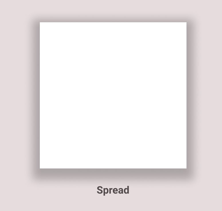
Being the most commonly applied effect in a UI design, drop shadows contribute to the depth and emotion of a design. A typical drop shadow relies on an offset from center (x, y, or both), a blur, and an opacity value. Some tools like Figma and Sketch have the ‘Spread’ option, too, where it makes the shadow look like a smaller element is casting it.
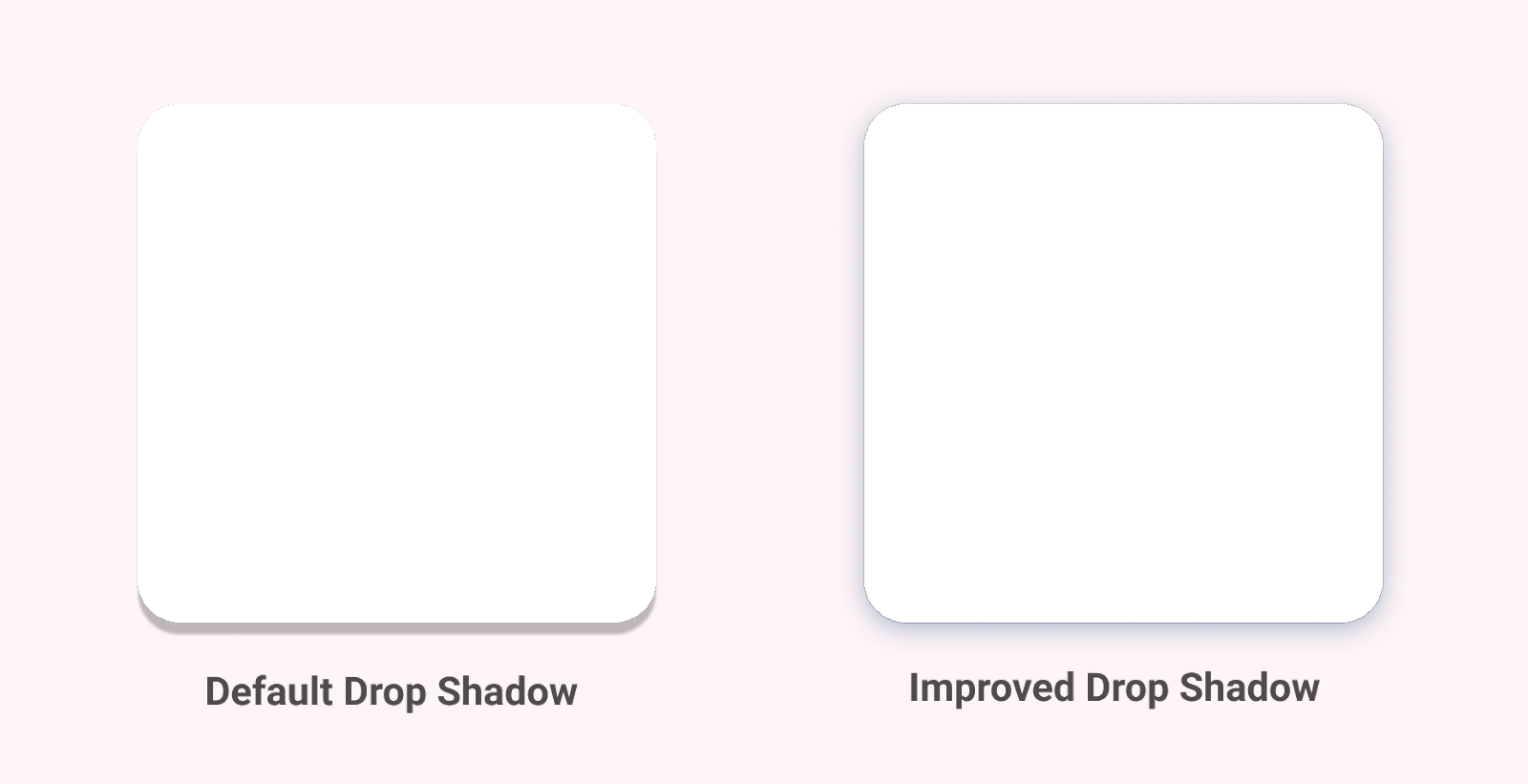
To make your design more natural-looking, avoid using pure black shadows, and instead, use one that is derived from a primary color instead.
Blurs
Blurs have the capability of transforming your visual design into an addictive experience. Most design tools nowadays have a Gaussian type of blur that spreads evenly in every direction—the larger the radius, the more prominent the blur. It is human nature to look at things that are in focus and ignore that aren’t, commonly known as accommodation reflex. Designers can use this effect to direct a user from unimportant items to valuable content easily.
Below are some of the types of blurs employed in a UI design:
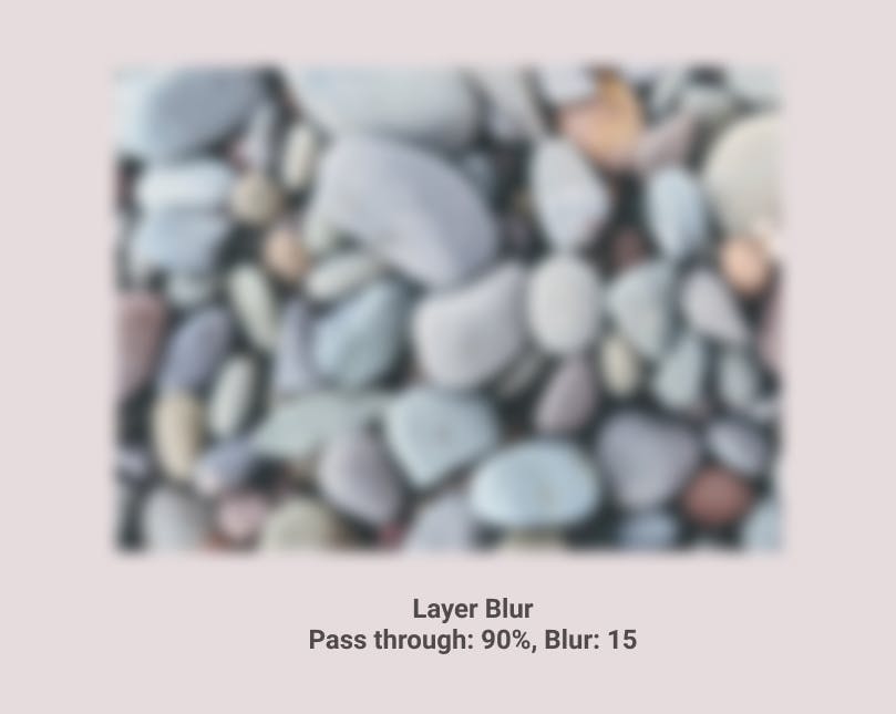
Layer Blur
Manipulation of Layer Blur, Hex, and Opacity values makes the creation of a design effortlessly professional.
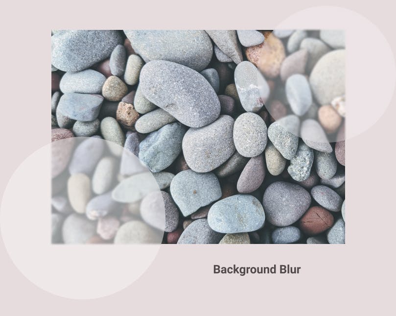
Background Blur
This effect became popular when Apple started using it in their software to achieve that behind smoke-glass effect on screens. Background blur inputs a see-through layer over an object, and is more glassy and glossy.
Effects & Their Settings
Drop Shadow
A negative X value moves the shadow behind the object to the left, and a positive one moves it to the right.
A negative Y value moves the shadow behind the object to the top, and a positive one moves it to the bottom.
Incorporating Blur
This softens the drop shadow effect, appealing more to the user’s emotions.
Incorporating Spread
As the name implies, it spreads the shadow effect across the dimension.
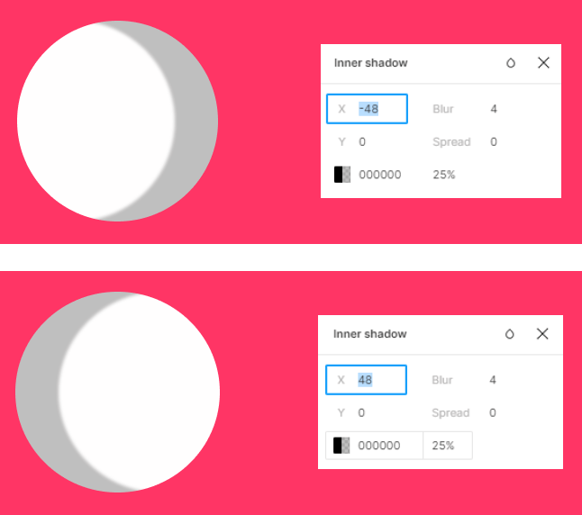
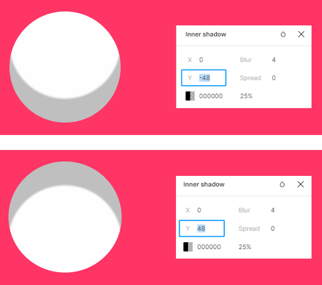
Inner Shadow
A negative X value moves the inner shadow inside the object to the right, and a positive one moves it to the left.

A negative Y value moves the inner shadow inside the object to the bottom, and a positive one moves it to the top.
Additional Mention
Neumorphism
Very popular these days to keep your design minimalistic and aesthetically pleasing, neumorphic elements tend to extrude from the background, made from exactly the same material as the background. If you look at it from the side, it isn't ‘floating’
It’s achieved using both negative and positive shadows, but the background cannot be fully white or fully black; it needs a little bit of tint so the shadows are visible.
Conclusion
All these effects have different kinds of impact—something we’re going to look deeply into in the next article. If you have a certain kind of impact in mind, you might want to give it a read.Hope you find this helpful!