Others
14 July 2021
Designing Responsive Websites
What is a Responsive Website?
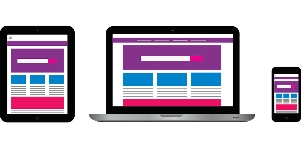
A responsive web design or RWD is a modern web solution that allows websites and pages to render across all types of devices and screen sizes. It automatically adapts to the device’s screen whether it’s a smartphone, desktop, or tablet. The way it works is that we use various settings to serve different style properties depending on the specification of the device on which the website will be displayed.
Importance of RWD
Since the mobile revolution started about almost a decade ago, a lot has changed in the way we interact with products and how we design them. The first smart device, the iPhone when it launched was basically a pocket sized computer that combined three things, phone, music player, and an internet browser and since then, designers have had to adapt their websites for small-size screens. Nowadays almost every client we get asks for one thing, a mobile version of their website. Now designing a separate version of a website just to fit a different screen is impractical and time consuming, so instead the design industry came up with a web design that would be flexible enough to support various types of screens resolutions, hence the approach called responsive web design or RWD was born.
How to design a Responsive Website?
Designing a responsive website requires three main ingredients, a flexible layout, media queries and flexible images and videos.
1. Flexible Layouts:
By flexible layouts we mean building the layout of a website with a flexible grid which is created using CSS. Flexible layouts consist of columns which rearrange themselves automatically in order to fit the size of the screen on which they are loaded.
2. Media Queries:
Flexible layouts themselves aren’t enough to make a website fully responsive. When the layout gets too small it’s likely to break into columns resulting in a not so pleasing content display. So in order to optimize the design of the website to fit different screens it is necessary to make use of media queries. Media queries allow us to inspect the physical characteristics of the device rendering our work according to that specific device. They also allow us to customize different styles for different screen sizes.
3. Flexible Images and Videos:
As the layout changes, it is essential for the content of the website to scale with the change in viewport. Using flexible layout and media queries won’t be enough to do so effectively so for that matter it is important to use images and videos that can adjust their size as the viewports change. All elements of a responsive design are distributed in a flexible container which resize themselves as the user switches to another device. A simple solution to making the content of the website scalable is to use the max-width property with a value of 100%.
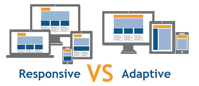
Is Adaptive Design the same as Responsive?
Adaptive and responsive designs are closely related, however they are not exactly the same. Where responsive designs use media queries to dynamically change the page layout based on the target device’s resolution, an adaptive design, on the other hand, uses static layouts that are based on breakpoints which don’t respond once they’re loaded, making adaptive designs a not so flexible solution for design optimization on various screens.
Conclusion:
Due to the speed at which technological innovations are being made, it is more important now than ever that we start designing websites that are flexible enough to effectively fit into any screen type. And to be clear, understanding how to make a design responsive to the user’s device doesn’t require much learning, rather it is a lot less stressful and more productive than learning how to design a different version of a website for every single device available. Responsive web designs help maintain consistency of the website’s design across various devices, improving the user’s experience altogether.