Others
24 November 2021
Color psychology in UX/UI design
Colors are one of the most vital visual experiences for humans as it’s the first thing you notice and easily remember when you see something new. Every time a person opens his/her eyes, their visual senses are stormed by perennial optimus stimuli, with contextual sights vying for attention. Using the right color placement and pallets we can evoke positive emotions and behaviors in humans. Colors have psychological and physiological properties and because of that each one of them hold different meanings in different cultures, for instance, Black color in some cultures represents sophistication and formality but in another culture it represents death or bad luck.
Colors are an important and very essential tool for any designer as it affects user’s decision making, experience and trust in the brand. It takes a total of 90 seconds for a user or customer to form an opinion about a product, be it digital or physical and this decision is heavily influenced by colors as it’s the first thing a person sees. Colors are usually viewed as aesthetic factors of the product, but in reality it is the core element of the emotional and cognitive impact of a design on users. The notion of psychology of colors can be applied in UX design as well as marketing.
Role of colors In UX/UI design:
UI design would not be the same if everything would have been black and white. Colors in UX/UI design play an important role whether it’s designing CTA buttons or whether it’s conveying emotions. Once you choose color as a main language to convey the clear idea of your brand, normal rules of color psychology don't apply to it and from there it starts becoming more and more complicated.
Color Ratio:
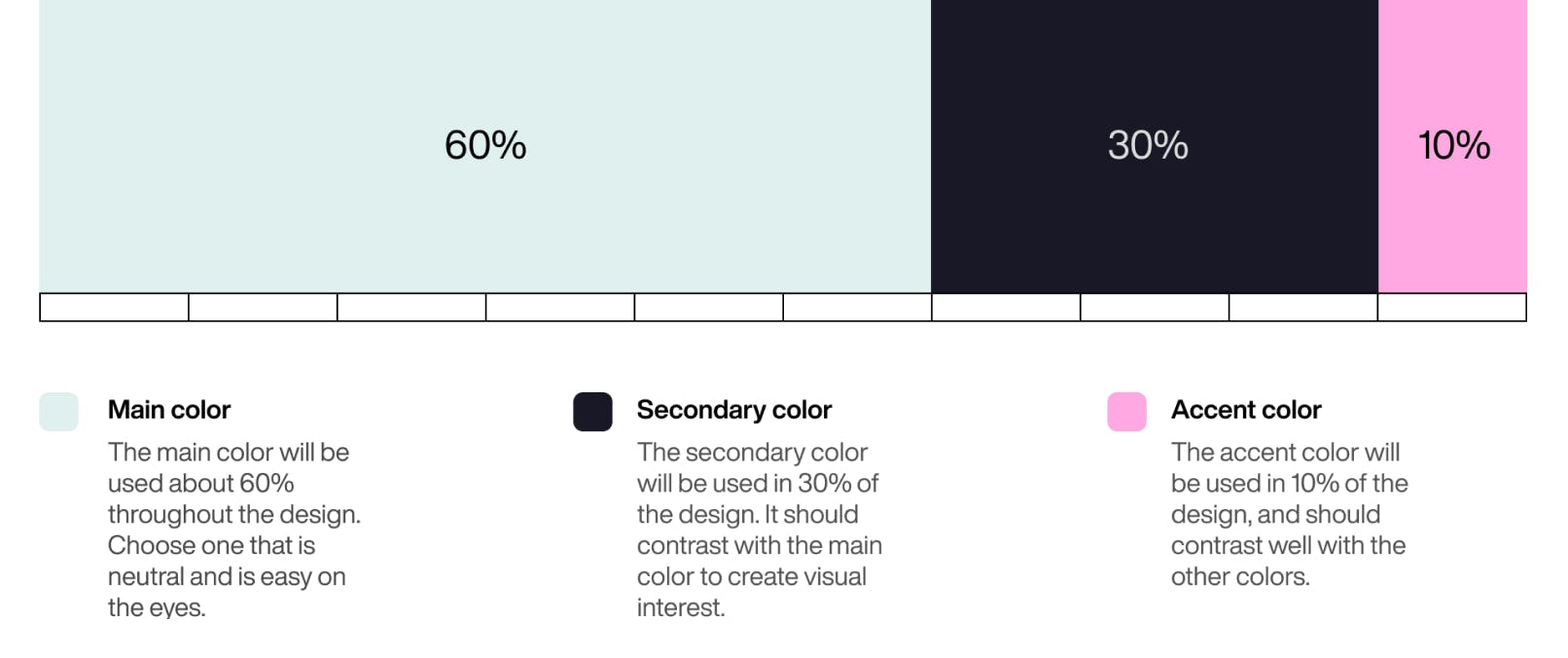
The most effective App or website may use a 60-30-10 ratio. As it's so easy to use- 60% is the dominant hue, 30% is the secondary color and 10% is for an accent color. Accent colors should be most vibrant as they’ll be used for the most critical parts for example CTA buttons etc. Main color can be kept neutral and the secondary color can be kept in contrast.
Shadows in UI design:
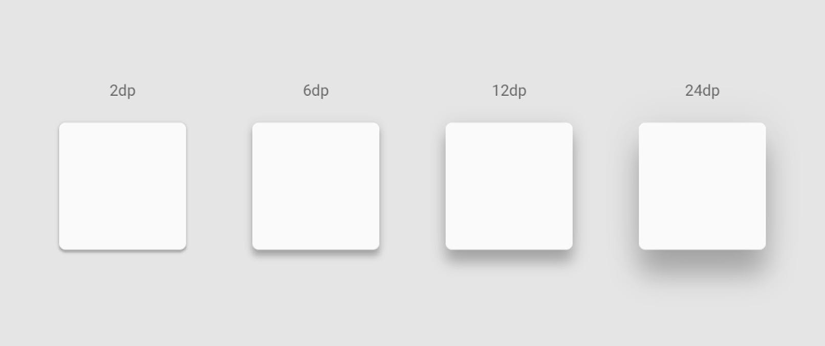
Shadows provide depth precision and the emphasis on the importance of a component or element. Using black color as shadow is one of the most common mistakes that designers make. While creating shadows. If we look around us, shadows inherit the color of the object, especially objects that are semi-transparent.
Colors in typography:

Typography is one of the crucial elements of UI Design and so improving it is as important if you want to improve UI and UX. Always try to keep the color of the body on a darker shade of gray shade rather than black. The reason for this is that the impact of contrast on screens is more severe than that on paper and so it can be really tiring to read the text with black shade.
Psychology behind following colors:
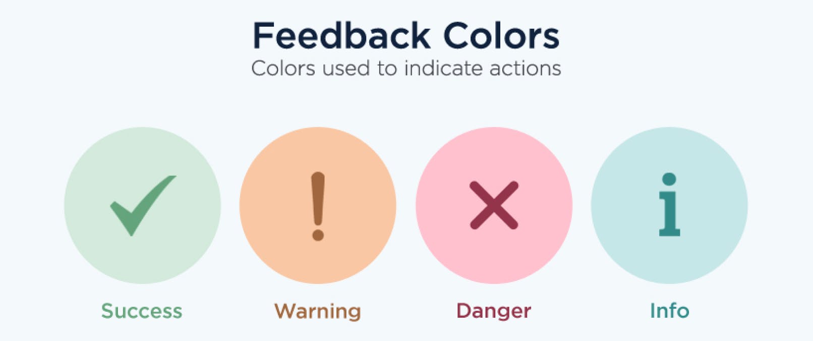
Red: Red color is used when you want to draw users attention to a certain element or if you want to highlight something.
Blue: Blue color depicts professionalism and professional relationships. This color is mainly used to build the trust of your brand among your clients.
Yellow: Yellow is the color of warmth and happiness. This color can be used to highlight inspiration and motivation.
Orange: The color of energy, spirituality and enthusiasm. This color is used to cast a shadow on graphics/products that symbolizes the above mentioned characteristics.
Purple: Purple is the color of magic, royalty and mystery. This color can be used to highlight the luxury aspect of the product.
Green: Green color represents nature and it is used to highlight UI designs that are associated with nature. This may include websites or applications for the travel and food industry.

