Others
29 September 2021
Choose the right fonts for your Web Design

There are a lot of factors that play a vital part while designing a web project. From deciding a color scheme to designing the layout, and making a perfect logo, everything holds massive importance. Another factor of paramount value in defining the theme of your web project is its fonts. In some cases, font alone can make the reader glued to the content of your website. While we’re discussing the importance of fonts, you should always be mindful of the negative impact a bad font can have on your web design and completely ruin the user experience. Therefore, choosing the right font for your content and elements is very crucial. In simple words, each font has a specific vibe.
This blog revolves around the things to take care of when you’re choosing the fonts for your design and content. We’ll also discuss some of the basic practices that will help you choose the best font for your web design.
Match your Content and Brand identity
Believe it or not, but users do judge a brand from its website and content. The font you use in writing content plays a massive role in how people will perceive your brand. For starters, If your brand identity resonates with a sophisticated audience that values luxury, you can go with the serif fonts. Similarly, if your brand is for a laidback audience, you can go with Sans serif fonts that will keep things clean and modern. Using the right fonts will allow you to impart an appropriate first impression to your user. The idea is to communicate through the content and set an overall mood, so make sure the font you choose goes along with the message that you’re trying to convey.
Get the Basics right

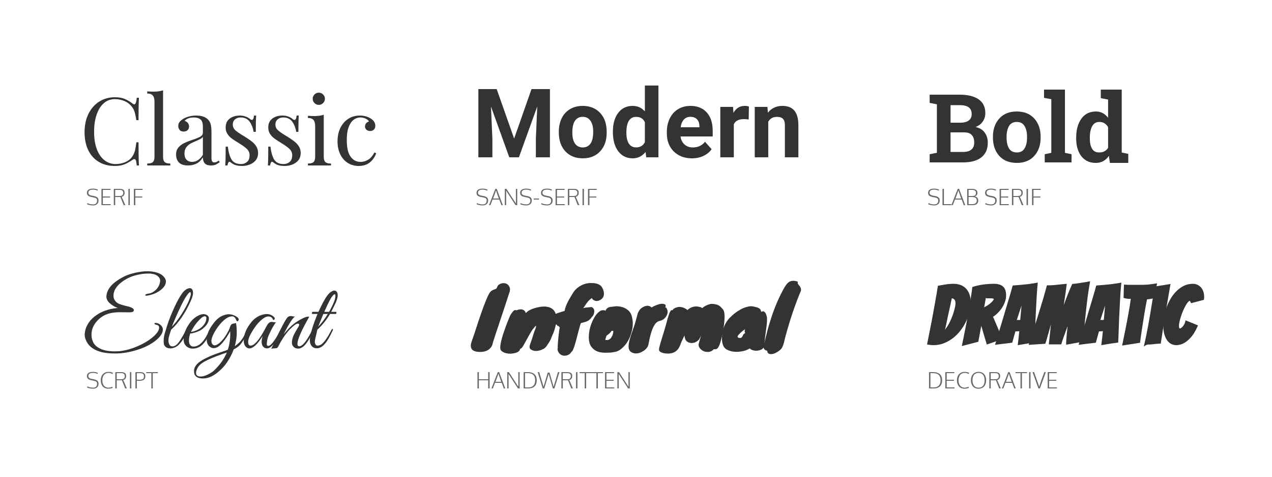
The art of typography is complex and incorporates multiple factors like readability, text alignment, and spacing. For fonts, the best place to start is to get the basics right. Here are some quick summaries of some of the most widely used fonts, and how they can be used:
Serif fonts: The serif is a thin line at the end of a letter or symbol. Serif fonts are considered classic, elegant and have been closely associated with printing. Some of the timeless fonts in this category are Georgia and Bodoni, and Times New Roman.
Sans serif fonts: These are fonts that do not have serif lines at the end of their characters. The sans serif is clean, modern, and looks neutral, making it ideal for minimalistic web designs.
Script fonts: Scripts, including cursive fonts, are created after handwriting styles. It’s best to keep this style limited only to topics because writing your body text in a script can be a problem for your audience. For example, Lucida Handwriting and Lobster.
Rank your Fonts
The rule of thumb suggests that you should never use more than three fonts on a web page. Along with the aesthetics, it helps with accessibility and maintains a consistent feel in your design.
Firstly, each of the three fonts then carries different levels of importance. To keep a clear concept of royalty, choose the main font, second font, and optional font. Your primary font is the most visible and should be used in the titles of your website. This is the font that will greatly affect your brand perception, even if it is not widely used everywhere. As a result, the main font can be very powerful and different from other fonts on your website.
Secondly, your secondary font can be used for most of the content written on the website. This includes categories, descriptions, blog articles, and more. While your primary font can be eye-catching and unique, your second font should be simpler and easy to read. Extremely colorful fonts are difficult to read when used over long sections of text.
Lastly, your accent font is the only one you use for a specific purpose. When it comes to websites, an accent font is often set to call to action, to draw attention to your most important button on the page. You can use accent font for your logo design font too.
Be watchful of the load time
No one’s got the time to wait for a page to load. It’s imperative to avoid using fonts that take too much time to load. Here are some tips to avoid the delay:
1. Stick to a limited number of font families. Around 2-3
2. Avoid downloading irrelevant font languages
3. Only select weights that you absolutely need
Conclusion
Some designers don’t pay much attention to what kind of image a font portrays. Your font speaks a lot about your brand and a user can know a lot about the style or vibe that you carry. For a consistent user experience, it is important that your content is readable and aesthetically pleasing. You can check out some quality fonts on Google fonts to get started and move to dafont.com to access extensive font libraries for choosing the perfect fonts for your next project.

